Home
Home PC Game Trailers
 News
News Menu
Menu[Top 10] Rocket League Best Esports Decals That Look Great
Updated: 03 Nov 2021 9:40 pm

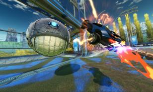
The Dominus sporting Spacestation Gaming's new Esport Decal!
 BY: Tarek Al Nomeiry
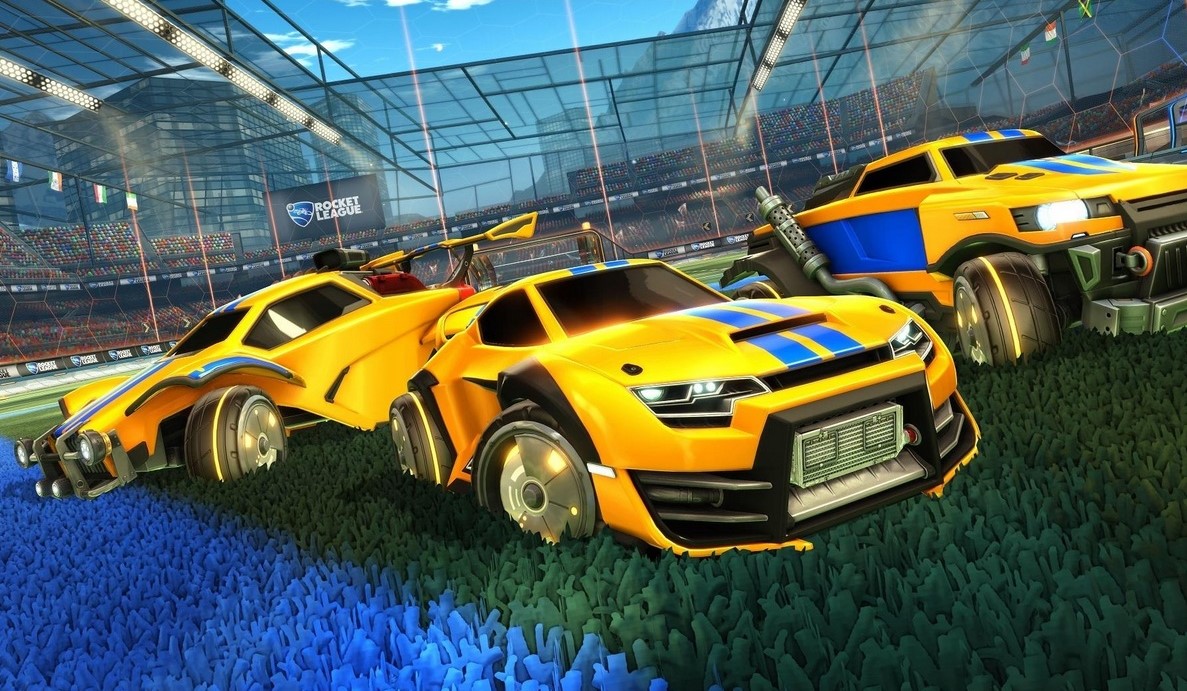
Time to represent your colors!
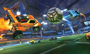
Ever since its introduction back in 2015, Rocket League has been a fun game. It revolves around driving around in your car, flying up in the air, and whiffing 9 out of 10 of your shots while your friends laugh and joke around. It’s been an ever-present aspect of the game which really sets it apart from other sports games.
But, it’s still a sports game. It didn’t take the players long before realizing just how both fun and competitive this game can be. That’s why it didn’t take even a year for the RLCS series to be born in 2016 and with it, many esports teams.
These esports teams have been duking it out for a long time, recruiting the best talent from all over the globe. But, to be a proper esports team, you need your colors on your whip to represent. Today we’ll be looking at the best decals of the esports teams ahead of the 2021/2022 season.
10- Rogue
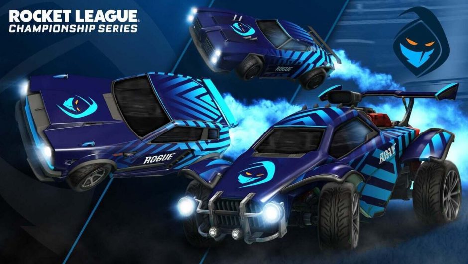
Team Rogue Decal
We start off the list with Rogue. Let me just say, they have one of the best logos out of all the Rocket League teams, but I wish their decal was as good as it. They made the colors match nicely around the logo using the same shade of blue while combining it well with a darker shade.
However, I felt a better contrast of colors would have suited them better, especially maybe using the yellow-ish tint that’s present in the eyes of their masked logo. Nonetheless, the half and half striped design on the back is really clean which helped them make my top 10.
9- Evil Geniuses
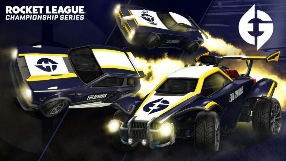
Evil Geniuses Decal
Yellow seems to be the theme for this season and the Evil Geniuses have delivered! They opted for a very minimalistic design where the colors don’t blend in at all. I like it. The white really brings out their logo well while the dark blue and yellows engulf the sides of the cars.
It may not be your cup of tea, but sometimes less is more I think, even if the Dominus version looks like a 12-year-old designed it… What is that hood and roof?! But, aside from that, I can’t fault the Octane and Fennec. They look to achieve something in style this year.
8- PWR
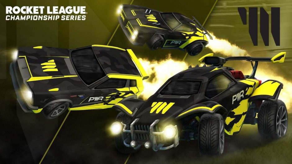
Team PWR Decal
They absolutely nailed it for me! Team PWR comes in this year in black with fierce yellow painted on the sides. A bright one too! I’m a sucker for any dark color which is contrasted with a brighter color! You can almost never go wrong with that.
The design, however, leaves much to be desired. Like come on guys, you could have given us a little more than just some scratch marks that look like the guy driving it couldn’t parallel park. Still though, a classic look for team PWR in their quest to dominate.
7- Team Envy
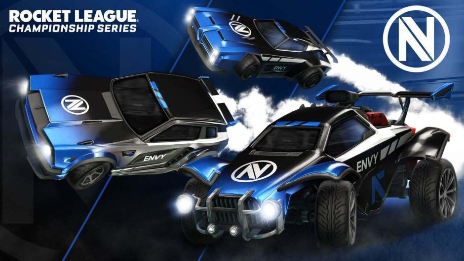
Team Envy Decal
Team Envy has taken a risk as the design seems a bit all over the place. It worked though. Love it or hate it, it has a bit of everything. From the shading on the hood to the edgy stripes on the sides, team Envy has gone all out in a new look that really suits them.
I personally think they crushed it. It’s a very simple design in terms of colors with only two as the main ones. Black and blue always work really well together, so they kept it simple in that category. On the flip side, everywhere you look you can see their logo which makes it seem like they’re almost sponsoring themselves. A bit weird, but I fancy it.
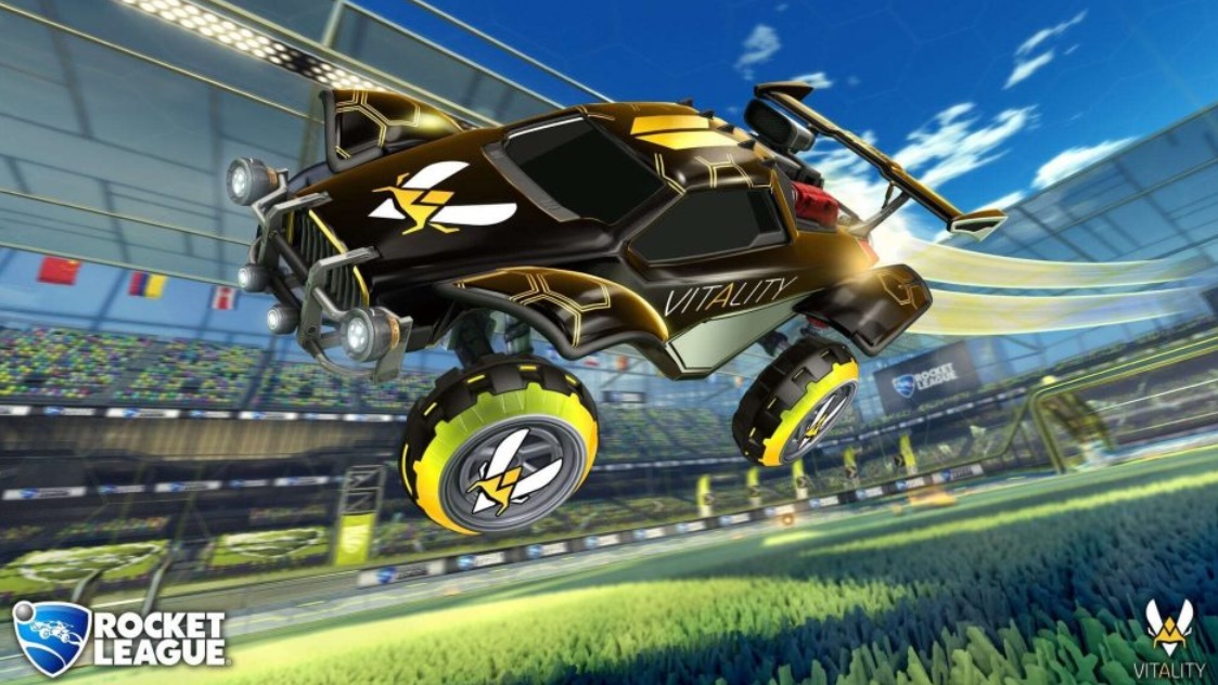
6- Team Vitality
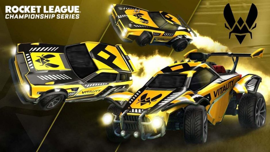
Team Vitality Decal
Team Vitality comes in with another funky design. A funky logo deserves a design that matches it. Every single side of the car looks different, and it seems they paid careful attention to the details. The simple Vitality on the side of the car gives it a really sporty look! It reminds me of how the old race track cars used to have their names or numbers on their sides for the audience to see.
You might be wondering why it’s number 6 on this list after all this praise. Well. You’d be lying to yourselves if you tell me this doesn’t have taxi vibes as well. Let’s hope team Vitality can get to their destination in the RLCS series.
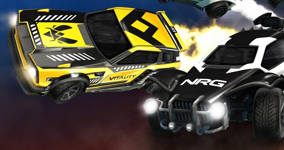
5- Team NRG
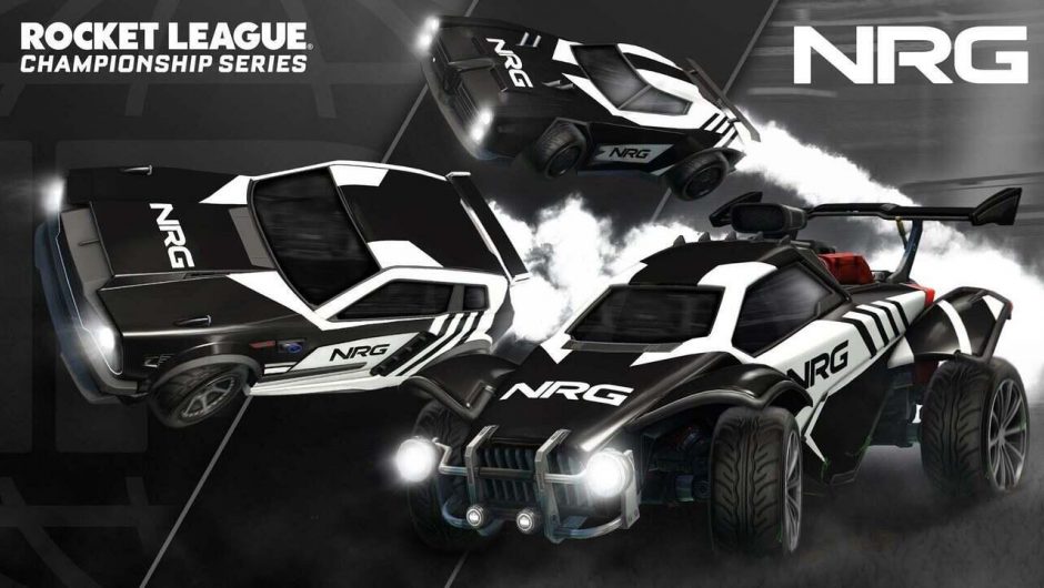
Team NRG Decal
Who doesn’t love a good black and white design? These two colors almost have their own fan club on social media! It’s very clear why they went with this popular choice as it makes them look serious. None of those fancy colors and stuff.
However, the design is pretty meh. Very unbalanced in a non-inspired way which makes it look almost too random and unfinished. Like they didn’t have time and had to release the cars. It’s still a really awesome looking clean overall look though, unlike Karmine Corp’s cars. They’re black and white too, but the dots on those cars… a children’s connect the dot book. +1 for team NRG.
4- Team Queso
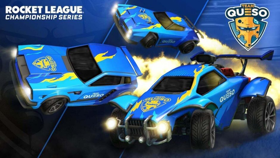
Team Queso Decal
The best team name along with one of the best and coolest designs! I like to keep it simple, but they took a risk, and it paid off! It’s one of those decals where you can’t really put your finger on it. Why does it look good? It just does and makes you smile in a way.
The fire on the one side going all the way up the roof matches their style and logo. It gives you a classic hot wheels car kinda vibe. The way the decal splits the Fennec in half alone gives it the number 4 spot for me. Unique.
3- Semper Esports
Semper Esports Decal
Someone must have told these teams that the black and yellow theme is really popular! So, team Semper Esports kicked it up a notch and transformed it into black and GOLD. Look at that roof and spoiler on the Octane. I can’t fault any part of this.
The thing that stands out for me is the way they left their logo on the front of the cars to stand out on their own while focusing on the back-end for the design. Not your normal stripes and line either. Seriously well done and different!
2- Ghost Gaming
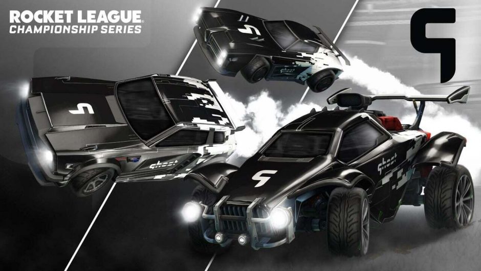
Ghost Gaming Decal
If you haven’t noticed by now, I may be a little biased for my black and white. Ghost Gaming’s decal would have made my top 3 regardless though. It’s a super simple sleek design that stands out at the same time. I love the way they included multiple shades of white, black, and even silver! It all just blends in together so well.
The design gives me hacker vibes as well with the pixelated markings running up the back of the cars. That Fennec and Dominus especially look fantastic! A design to match their name and logo. Perfect.
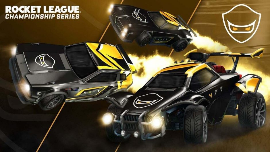
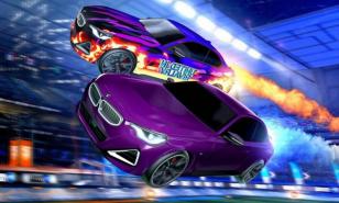
1- Spacestation Gaming
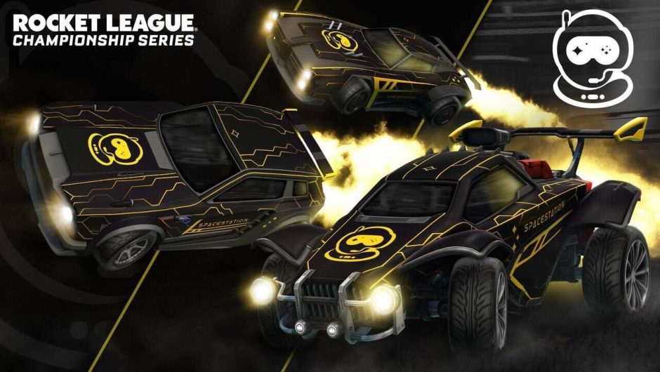
Spacestation Gaming Decal
I think very few might disagree with me on this one. I took one look at it and decided it was going to be my top pick before I even chose the rest! Spacestation Gaming seriously went up another level this year. I rarely look at an Esports decal and think “I want to buy this one!”, but here I am.
The design is impressively centered around their logo. The yellow lines are thin and work to make the car look simple while their spaceman logo stands out so well. It’s an awesome futuristic look as well to match their name. I love everything about this and wish them the best on their journey to the top podium.
You may also be interested in:
- Top 15 Rocket League Tips For Outplaying Your Opponents
- 15 Best Rocket League Settings That Give You an Advantage
- Top 10 Rocket League Best Plays (2020)
- [Top 10] Rocket League Best Players In The World Today
- [Top 10] Rocket League Best Car Designs
- Top 5 Rocket League Best Cars
- Best Wheels In Rocket League That Look Freakin Awesome
- Top 5 Rocket League Best Crates
Share this Article:

Image Gallery

Team BDS Decal
The Octane sporting BDS colors
- Log in or register to post comments


![[Top 10] Rocket League Best Engine Sounds That Are Awesome](https://www.gamersdecide.com/sites/default/files/styles/308x185-scale-crop--more-top-stories/public/maxresdefault_208.jpg "[Top 10] Rocket League Best Engine Sounds That Are Awesome")


![[Top 15] Rocket League Best Items (Ranked Good To Best)](https://www.gamersdecide.com/sites/default/files/styles/308x185-scale-crop--more-top-stories/public/maxresdefault_207.jpg "[Top 15] Rocket League Best Items (Ranked Good To Best)")


![[Top 15] Best Rocket League Cars (Used By Pros)](https://www.gamersdecide.com/sites/default/files/styles/308x185-scale-crop--more-top-stories/public/maxresdefault_209.jpg "[Top 15] Best Rocket League Cars (Used By Pros)")


![[Top 25] Best Rocket League Car Designs That Look Freakin' Awesome](https://www.gamersdecide.com/sites/default/files/styles/308x185-scale-crop--more-top-stories/public/screenshot_1_8.jpg "[Top 25] Best Rocket League Car Designs That Look Freakin' Awesome")

![[Top 15] Rocket League Best Wheels That Look Freakin' Awesome!](https://www.gamersdecide.com/sites/default/files/styles/308x185-scale-crop--more-top-stories/public/leo-windham-rl-wheels-02.jpg "[Top 15] Rocket League Best Wheels That Look Freakin' Awesome!")